SEC EDGAR Financial Data Pipeline
An ETL pipeline that bulk downloads 10 years of SEC filing data, extracts it from 40 quarterly ZIP files, and loads it into MySQL — all in a single run. Here's what it actually looks like when it works.

Bulk downloading 40 quarters at once
The script pulls every quarterly ZIP from SEC EDGAR's archive — 2014 Q1 through 2023 Q3 — and downloads them one by one. The terminal output shows each file location as it lands.

Extraction and renaming
Each ZIP contains 8 files. The pipeline extracts only num.txt and sub.txt, renames them per quarter (e.g. 2019Q2_num.txt), and drops them into a clean output folder. 60 files, named and organized automatically.

The financial_data table
After filtering for R&D, Net Income, and Revenue and cleaning the data, rows are loaded into the financial_data table in MySQL. This is the table that powers Project 02. Every spike calculation runs against it. Each row ties a company to a specific metric, date, and dollar value.

Metadata table — 40 quarters tracked
A companion metadata table logs every quarter ingested — source file, row count, and load timestamp. One row per quarter, 40 total. It's how you verify the pipeline ran cleanly without touching the main table.
R&D Expense Spikes Predict Short-Term Price Declines
An original quantitative thesis tested across 1,404 public companies. The finding: R&D expense spikes reliably precede short-term stock price drops, and the bigger the spike, the stronger the signal — up to a point.

Top 10 companies by spike percent
The first query ranks every company by their largest single-quarter R&D spike. The top 10 are dominated by micro-caps — small absolute dollar changes produce extreme percentages. The bucketing analysis accounts for this by grouping all 100%+ outliers together.

Companies sorted into five bands
Companies are sorted by their average spike percentage into five buckets: 0–10%, 10–20%, 20–50%, 50–100%, and 100%+. Each bucket contains roughly 280 companies — roughly equal distribution which makes the drop rate comparison meaningful.

Drop rate climbs from 55.6% to 68.5% as spikes get larger
The core result: companies with small R&D spikes (0–10%) see prices drop 30 days later 55.6% of the time. As spike magnitude increases, that rate climbs — peaking at 68.5% for 50–100% spikes before pulling back slightly at 100%+ — likely where micro-cap outliers dilute the signal. A pattern that repeats across five independent groups of ~280 companies is not noise.

Running average per company over time
A running average of growth percentage per company using SQL window functions. Tracks whether a company's R&D behavior is getting more or less volatile over the 10-year window — useful for spotting companies that are ramping up research spend consistently versus one-time spikes.
Personal Finance Tracker
A fully working mobile app running on Expo Go with a FastAPI backend. Built to actually use, not just demo — full CRUD, automatic subscription detection, and spending summaries by day, month, and year.
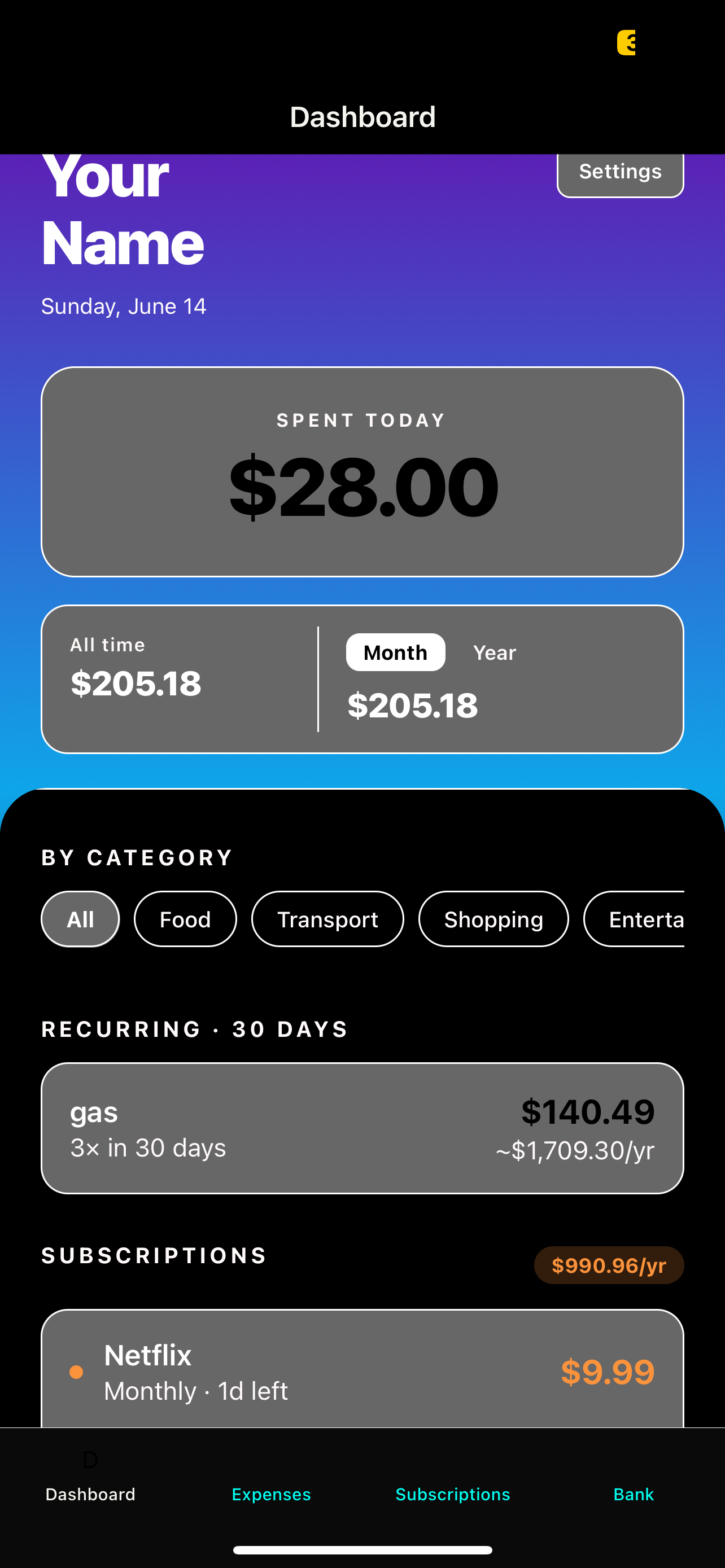
Spending summary at a glance
The dashboard shows today's spending, this month's total, and an all-time breakdown by category. Everything updates the moment a new expense is added — no refresh needed.
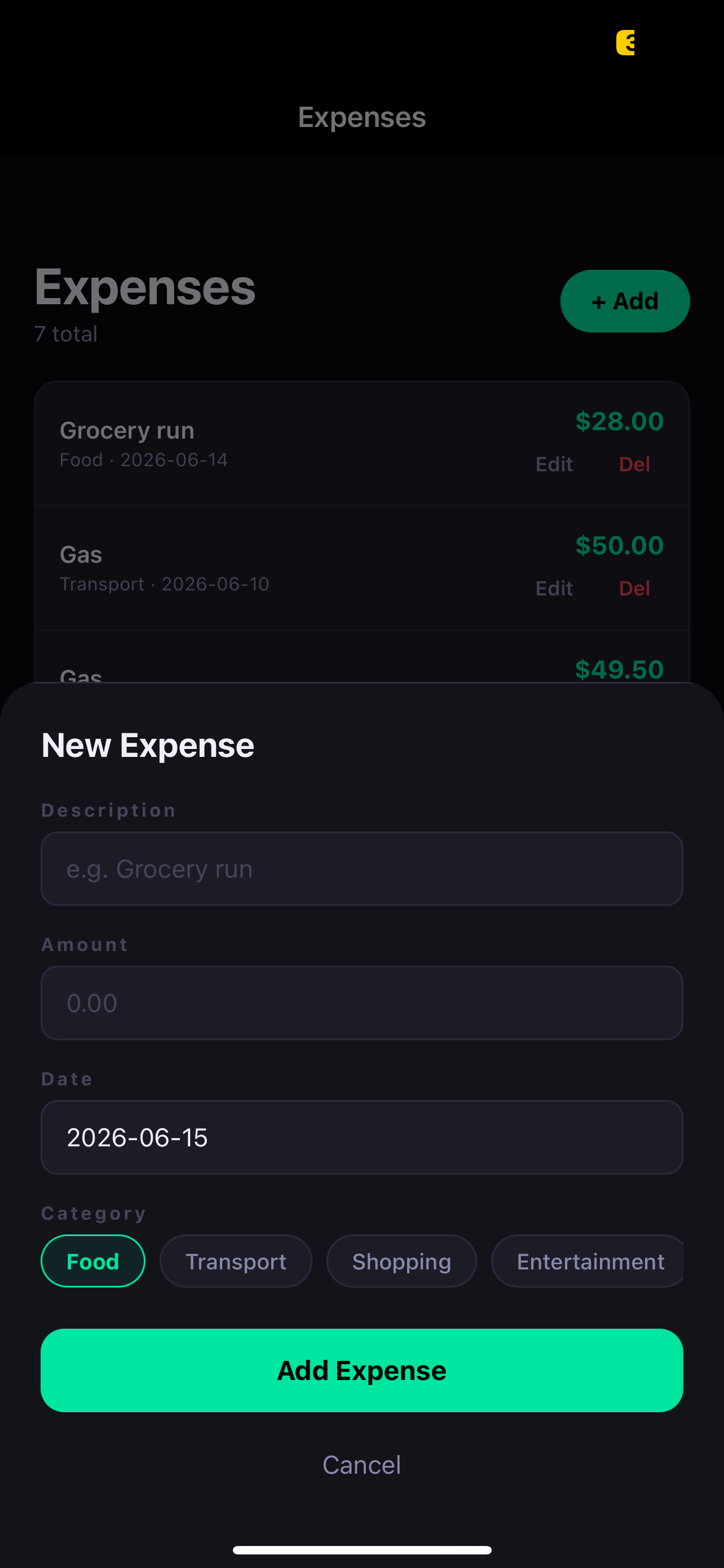
Full CRUD on mobile
Add, edit, and delete expenses directly in the app. The FastAPI backend handles validation and persistence to SQLite. PUT and DELETE endpoints mean nothing is permanent — every entry is editable.
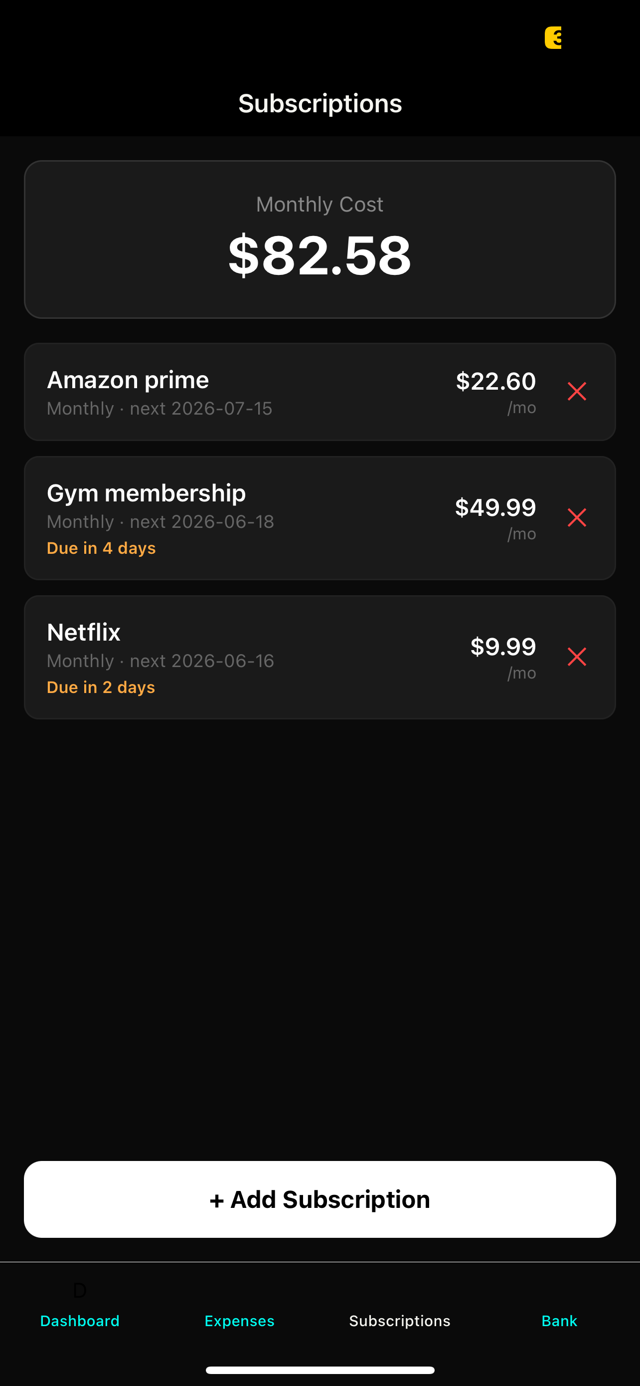
Auto-detected recurring charges
APScheduler runs in the background detecting recurring patterns in the expense history. Gas was flagged automatically — same merchant, regular interval. Manual subscriptions show days until next charge, and the dashboard projects the total annualized cost across everything.

SQLite database with real data
The SQLite database holds both expenses and subscriptions tables. A screenshot of the raw DB — even opened in DB Browser — shows the schema is clean and the data is real. This is what "fully working" actually means.
S&P 500 Anomaly Detection
Real-time anomaly detection across all 500 S&P constituents, with AI-generated explanations for each signal. The only project here with a live deployed URL — and the most complex stack by far.

500 stocks, filtered down to what matters
The React frontend shows every high-confidence anomaly — flagged by both Z-Score and Isolation Forest — with return Z-score, volume Z-score, signal type, and ticker. Searchable and filterable. The table updates each time the detection pipeline runs.

Claude explains why it happened
Click any anomaly row and Claude AI generates a plain-language explanation of the likely cause, pulling context from recent news headlines fetched via NewsAPI. Not just "this was anomalous" — but what probably drove it. That's the part that makes this useful rather than just interesting.

Narrowing 500 stocks to one ticker
Type a ticker into the search bar and the table filters instantly. Useful for checking whether a specific stock has had any anomalous behavior in the last 90 days — a 5-second answer that would otherwise require pulling and analyzing the data manually.

Z-Score and Isolation Forest must agree
A day is only marked high-confidence when both models flag it independently. Z-Score catches statistical outliers in return and volume. Isolation Forest catches complex patterns Z-Score misses. Requiring agreement filters noise and makes each flagged row meaningful.